 Public health students know the famous story of John Snow’s
1854 map of London cholera cases that highlighted clustering around the Broad
Street water pump. He removed the pump handle and the number of deaths dropped.
(It turns out that deaths were dropping anyway and the pump handle may have had
nothing to do with it, but in any case .
. . ) The story demonstrates the power of visualizing data to find solutions. The newest
addition to the CTHPP
Book Club, Medical Illuminations
is an entertaining walk through dozens of health care examples of good, bad and
better examples of data delivery with lessons to help make data more clear and
avoid counterproductive mistakes. Issac Asimov said, “The most exciting phrase
to hear in science. The one that heralds new discoveries, is not ‘Eureka’ but
‘That’s funny . . . ‘”. Constructive data analysis, editing and visualization
can drive the “That’s funny” moment. This books shows us how.
Public health students know the famous story of John Snow’s
1854 map of London cholera cases that highlighted clustering around the Broad
Street water pump. He removed the pump handle and the number of deaths dropped.
(It turns out that deaths were dropping anyway and the pump handle may have had
nothing to do with it, but in any case .
. . ) The story demonstrates the power of visualizing data to find solutions. The newest
addition to the CTHPP
Book Club, Medical Illuminations
is an entertaining walk through dozens of health care examples of good, bad and
better examples of data delivery with lessons to help make data more clear and
avoid counterproductive mistakes. Issac Asimov said, “The most exciting phrase
to hear in science. The one that heralds new discoveries, is not ‘Eureka’ but
‘That’s funny . . . ‘”. Constructive data analysis, editing and visualization
can drive the “That’s funny” moment. This books shows us how.Thursday, February 5, 2015
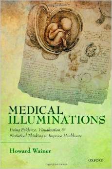
New to the Book Club -- Medical Illuminations: Using Evidence, Visualization & Statistical Thinking to Improve Healthcare
 Public health students know the famous story of John Snow’s
1854 map of London cholera cases that highlighted clustering around the Broad
Street water pump. He removed the pump handle and the number of deaths dropped.
(It turns out that deaths were dropping anyway and the pump handle may have had
nothing to do with it, but in any case .
. . ) The story demonstrates the power of visualizing data to find solutions. The newest
addition to the CTHPP
Book Club, Medical Illuminations
is an entertaining walk through dozens of health care examples of good, bad and
better examples of data delivery with lessons to help make data more clear and
avoid counterproductive mistakes. Issac Asimov said, “The most exciting phrase
to hear in science. The one that heralds new discoveries, is not ‘Eureka’ but
‘That’s funny . . . ‘”. Constructive data analysis, editing and visualization
can drive the “That’s funny” moment. This books shows us how.